Five Simple Tweaks to Make Your Homepage More Effective
When it comes to growing your business
 your corporate website is one of the most important things to get right because whether your company is B2B or B2C, it’s number one immediate job is to convert visitors to leads or sales (whichever your model calls for). The worst thing that can happen is for you to spend a bunch of time and money generating traffic to your website, only to have most of your visitors look and leave (bounce).
Here are five simple tweaks you can make to your homepage right now to increase the percentage of visitors who stay on your website, purchase a product (if you have an e-commerce model) or fill out some kind of form resulting in an appointment (if your process requires this).
Get’cha Head(er) In The Game
Although your entire home page (and whole website for that matter) is important when it comes to conversion, this article will focus on tweaks you can make specifically to your website header. The header (sometimes referred to the head mast) is the top part of your website that displays “above the fold” (prior to scrolling down). It includes your logo, the navigation menu, usually a background image or sometimes slider/carousel, a headline, some additional copy explaining your product or service, and (hopefully) a call to action.
Because it’s the first thing visitors see when they arrive on your site, it’s the number one factor in determining what happens next. They will make a decision to stay and shop, or bounce, in about eight seconds (some say five or less).
What does this mean for you? It means that if you’re going to capitalize on the traffic to your website, optimizing your header for conversion is paramount. Alone, this won’t guarantee conversion, but if your header isn’t working, it has the power to kill your chances entirely. Let’s start with an older version of Smithsonian’s header.
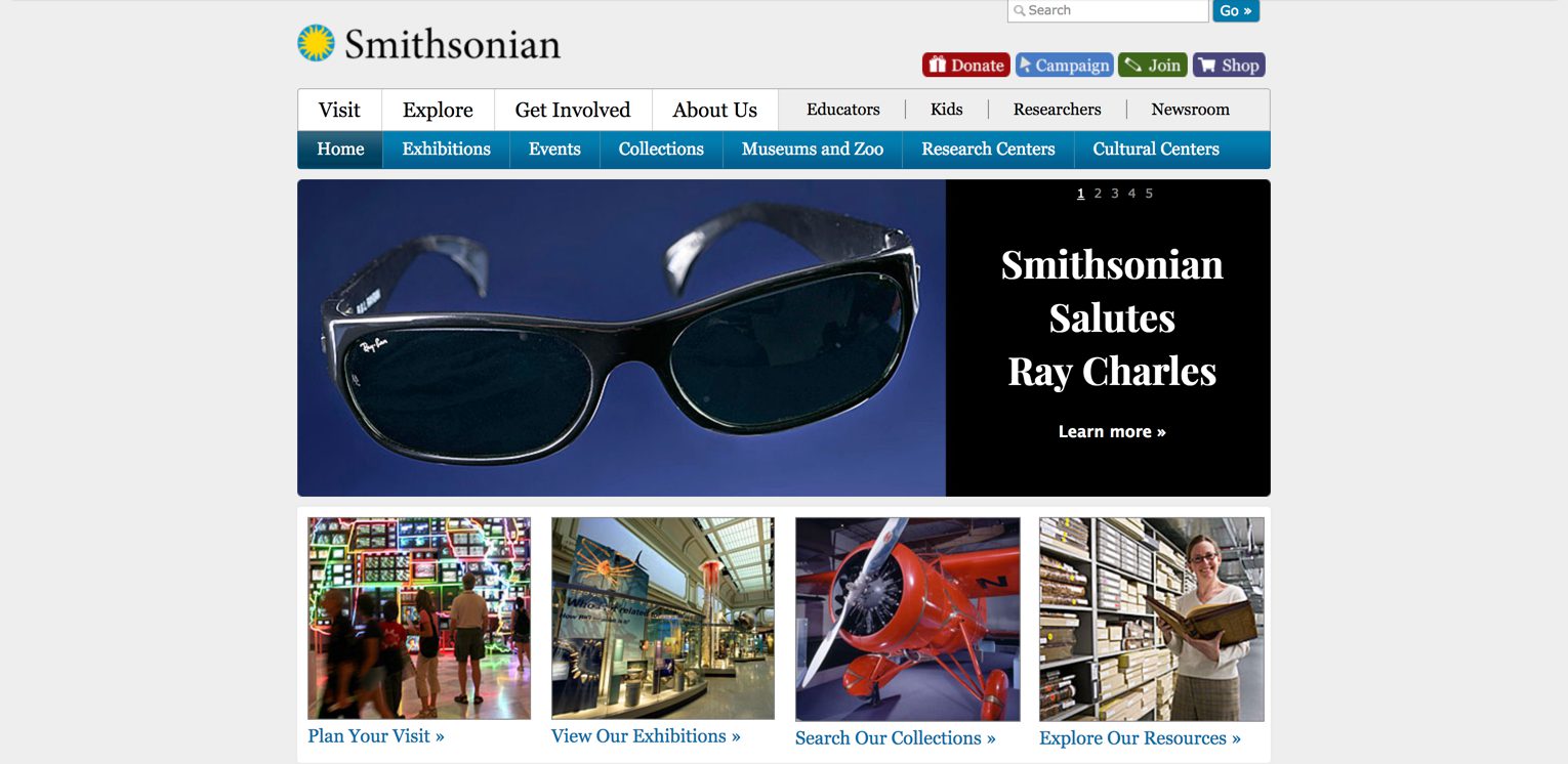
Is this an effective header? Why or why not? What makes for a great header, anyway? In a word, clarity.
Time Out
Before we get into the ingredients of a clear header, we need to talk about what we mean by clarity. While the following may seem counterintuitive, stick with me. Here goes: Your website isn’t about you or your company at all. That’s right. Your company website, the one you’re designing, optimizing, paying for, lovingly petting and whispering sweet nothings to at night, should be about … your customer.
Because your customer is the hero of their own story, your role is to come alongside them, guiding them into the transformation they are seeking.
A Clear Header
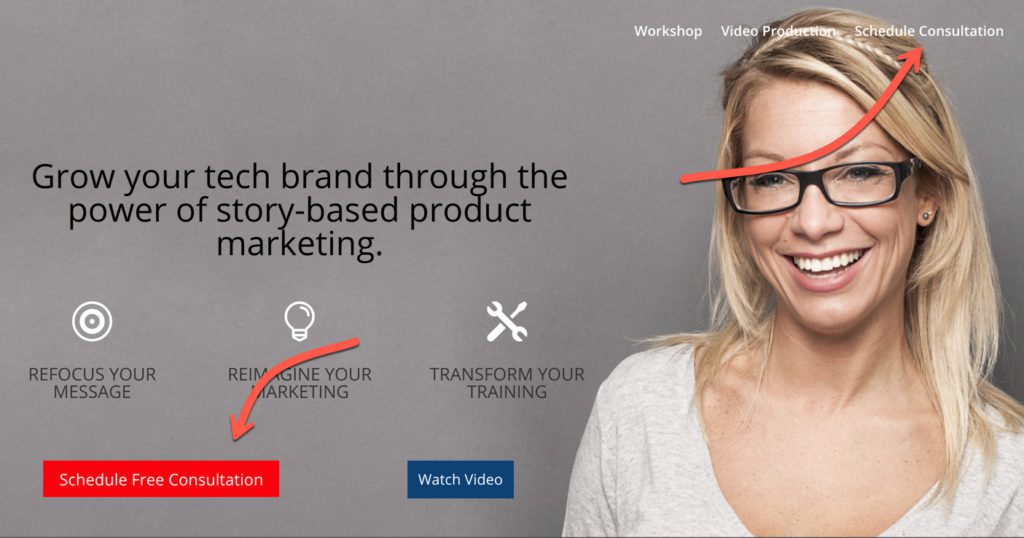
And we’re back. A clear header has several ingredients to help your visitors find themselves in the story your website is telling. Beyond your logo (usually top left), you’re going to need a simplified navigation menu, a background image that casts a vision of success, compelling copy, visual balance, and a clear call to action.
1. A Simplified Menu
The first thing you need for a better header (and website) is a simplified menu. Many websites we see have complicated or cluttered menu structures that increase the amount of information visitors must process in that critical 8-second period. Here’s a close up of that old version of the Smithsonian’s website:
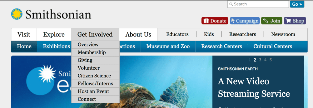
Yuck! Too many options! I’m overwhelmed.
Even if your company has many offerings, it’s a good idea to reduce the number of menu options to a maximum of four or five – and one of those options should be your direct call to action (more on CTAs later). On their new site, look how nicely Smithsonian simplified their menu options:

Isn’t that so much simpler and easier?
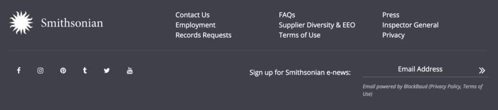
On your site, if you’re worried about not being able to include all your pages in a simplified structure, use the footer menu as your junk drawer for everything else, just like Smithsonian did:
2. Background Image
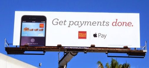
The second thing you need for a website that converts is the right header background image. A picture is worth … (you finish the rest). We all know how important images and nonverbals are in communication, so what should your header image communicate? Answer: success.
To get this right, we have to go beyond the external problems our customers face, to understand their internal (emotional) and philosophical problems as well.
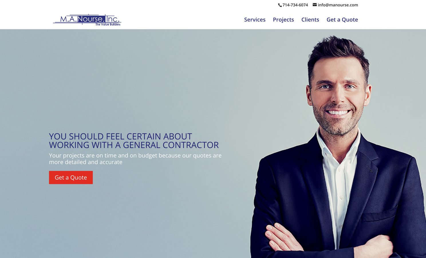
This will look different for every company because success is defined differently for each one. In the case of this commercial general contractor, the internal/emotional problem their clients’ face is uncertainty or anxiety in choosing a contractor or embarking on a big, drawn out, and expensive commercial construction project. Knowing this, what should the image of success convey? If you said confidence and certainty, you’re right!
Did they pull it off? Does this image convey confidence, certainty, and happiness?
This brings us to an important point. You probably aren’t in the business you think you are; you probably don’t sell what you think you sell. In the case of this commercial GC, they don’t simply sell commercial construction services – they sell a character transformation for their clients. They sell the journey from uncertain, anxious, or nervous … to confident, certain, and happy.
3. Compelling Copy
The third critical ingredient for a header that converts is
In the case of M.A. Nourse, they are addressing the desire of the visitor for certainty about what kind of contractor they work with (and conversely, the fear of not doing so), and the desire to finish on-time and on-budget (and conversely, to avoid failing at this). Notice they make a statement about themselves (“our quotes”), but in connection with the prospect’s goals; the emphasis is on the client getting what they want.
Remember, this story is not about you (directly).
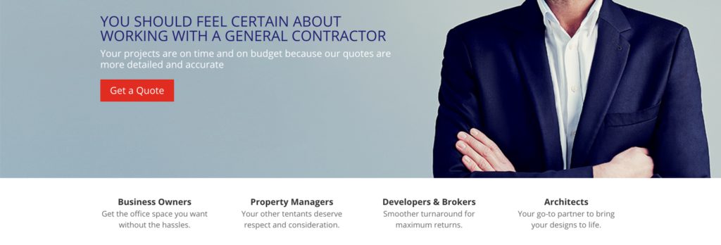
In the lower section (still above the fold), they call out four specific audiences: business owners, property managers, developers & brokers, and architects … with a targeted message to each. Remember, visitors need to find themselves in the story you are telling, in eight (or five) seconds or less.
4. Visual Balance
 The fourth item every website/header needs is
People generally don’t “read” websites in the strictest sense anymore – they scan them.
This means that if you want your message and content consumed, your website needs to be visually balanced and scannable.
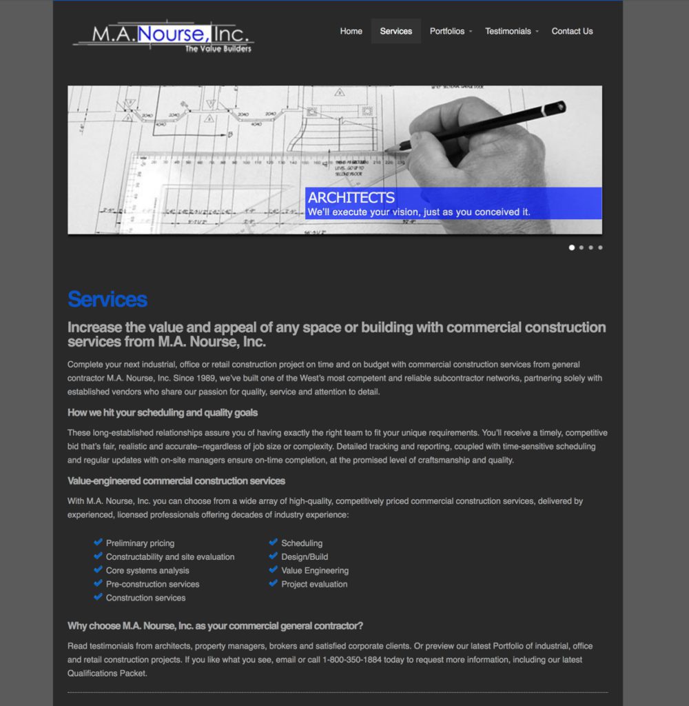
Here’s an example of manourse.com before it was updated. Notice how it only uses one image, features large, dense blocks of text below the fold, and has limited use of whitespace. As a whole, it’s not very scannable. Due to the background color and text size, not very readable either. To make matters worse, if you simply look at the header section above the fold, it doesn’t convey much information there at all.
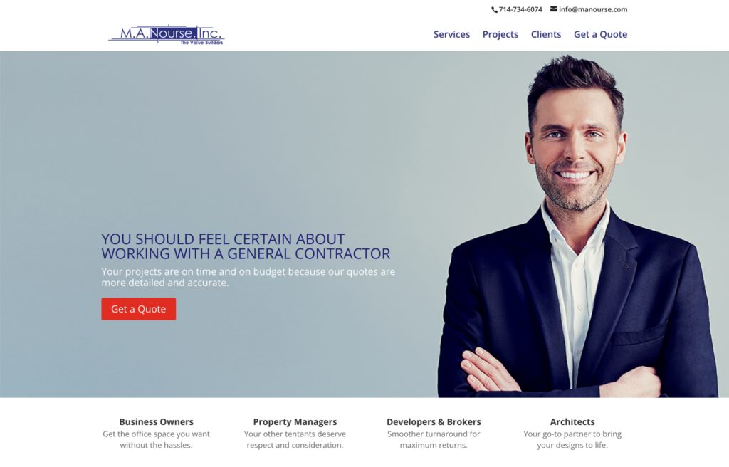
Compare and contrast that with the new manourse.com.
 Notice three things:
- A single, large image portraying a vision success, not something emotionally neutral or boring like a blueprint. Many companies like to use image sliders or carousels, but I’m not crazy about using multiple images. It’s hard enough to get visitors to digest all the information we’re giving them in that 8-second pocket – additional images just must make it more difficult.
- Text and typography/font that is easy to read, and not too densely packed (which can be intimidating at a glance)
- A good use of whitespace to break up content into bite-sized sections. Note that whitespace isn’t always white. Rather it refers to the empty space that creates a buffer around your content.
Does this new design remind you of anything you have seen in the offline world? How about a something you can read while driving the freeway at 70 MPH?
In short, the better header is easily scannable and therefore, accessible and consumable. A message laid out in a header like this will be consumed and received much more readily than in an old-school style.
5. A Clear Call to Action (CTA)
As previously mentioned, the worst case scenario is spending time and money only for visitors to bounce without doing anything. The purpose of a CTA is to get our visitors to do something. There are two kinds of CTAs: direct and transitional.
A direct call to action is the end game – it’s ultimately what you want to have
The direct CTA button should be visible in every section of your website, and in the top right option in your navigation menu as well.
On the other hand, a transitional CTA is selling something different. 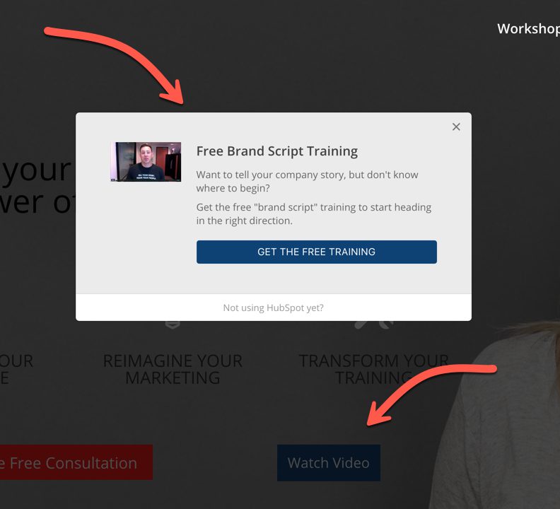 If your site visitor is not ready to meet you at the altar (direct CTA), they may be willing to take a much smaller step with you. Perhaps they will watch a video, download a free eBook, register for a webinar, take a free video course, or take an online assessment.
When your visitors say “yes” to a transitional CTA, you have the opportunity to nurture them, over time, to the point where they are ready to meet you at the altar. Transitional CTAs can be presented as buttons alongside direct CTAs (Watch Video), or email opt-in popups, quizzes, etc.
The 8 Second Rule
Product Managers/Marketers use something called the 8 second rule when doing user acceptance testing for the products they are developing. Hand the user the product/app/widget and they have 8 seconds to answer two questions: “What is it?” and “Do you love it?” If they don’t “get it” in 8 seconds or less, you don’t have a viable product yet.
When it comes to predicting if your homepage header will successfully convert, a similar rule or test is useful. Someone who has never seen your site before ought to be able to open the laptop lid and answer these three questions in five seconds: “What does this company do?” “How does it benefit me?” and “How do I get it?”
If they can’t, your header isn’t clear enough yet.
Wrapping Up
Did you get all five? 1) A simplified navigation menu, 2) a background image that casts a vision of success, 3) compelling copy, 4) visual balance, and 5) a clear call to action.
Make these changes to your home page header and watch your conversion rates climb as your visitors understand your message and offering faster than ever. These principles apply to mobile, landing pages, and offline marketing as well.
If you need help optimizing your website header to increase

Kevin Krusiewicz
Founder + vCMO